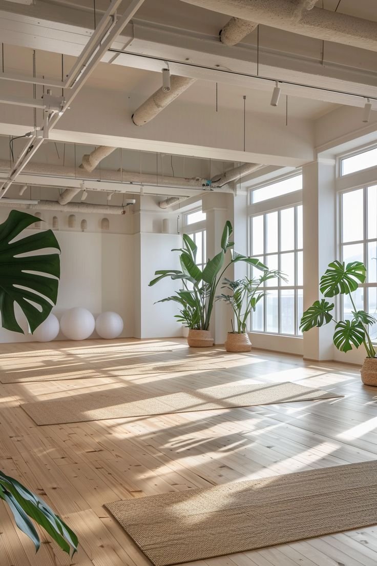
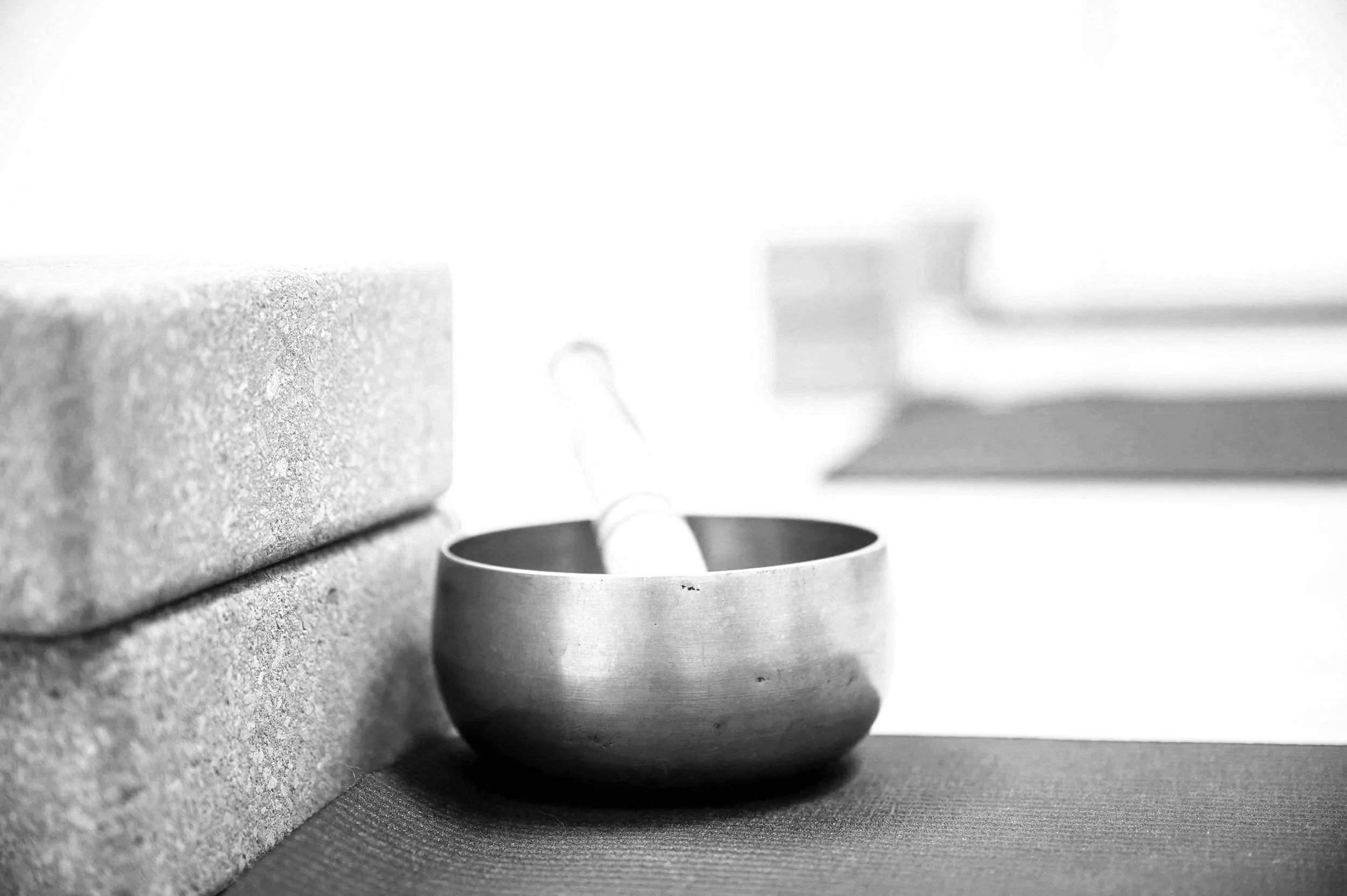
Brussels Boutique Yoga Studio
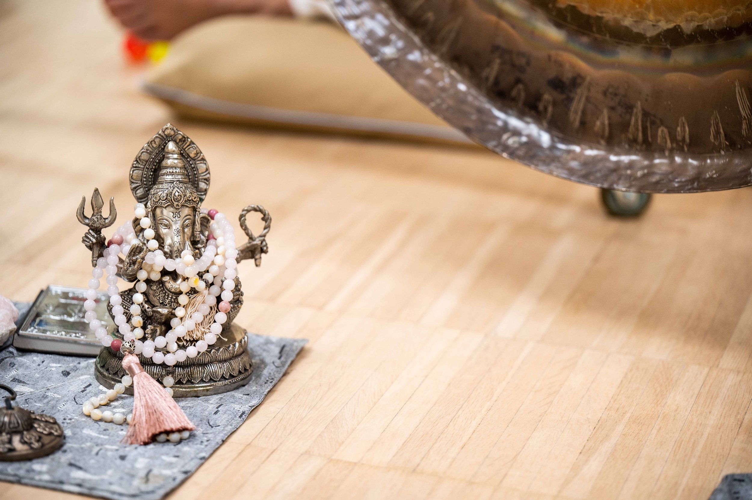
MOOD BOARD


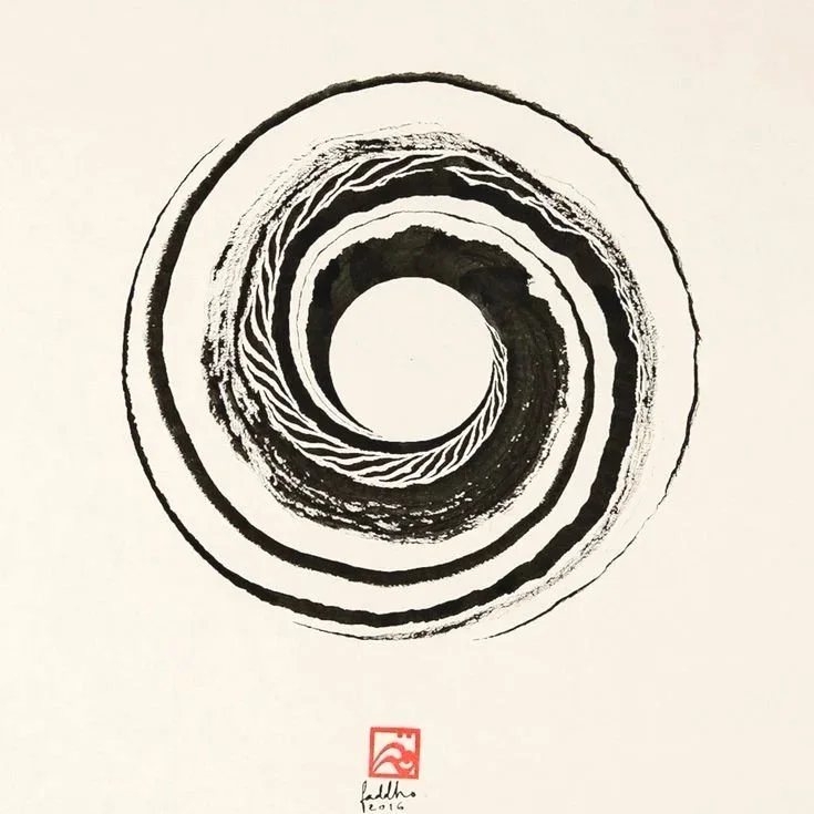
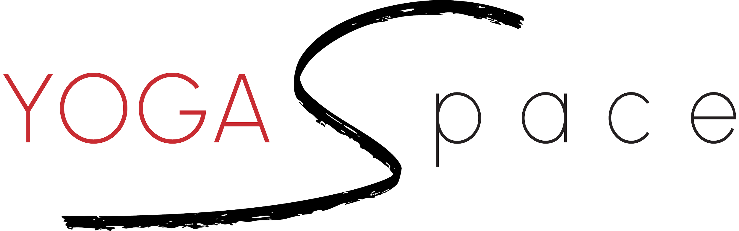
LOGO IDEA
The branding for Yoga Space was developed to reflect the studio’s core essence — openness, calm, and community.
The concept of space became the central theme, both as a physical environment and as a state of mind. The studio itself is bright and expansive, designed to make everyone feel welcome and at ease, and the visual identity needed to translate that same sense of spaciousness and inclusion.
The logo design began with a focus on simplicity and clarity. I chose a clean, modern typeface to express balance and lightness, allowing negative space to play an important role in conveying calm and harmony. The black “S” draws inspiration from traditional calligraphy, referencing the graceful motion of a brushstroke. This gesture introduces a sense of flow and mindfulness — qualities that naturally connect to the practice of yoga.
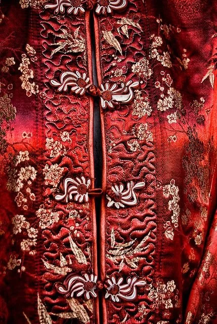
To complement the minimalist composition, a subtle touch of red was added. This detail introduces warmth and vitality while acknowledging the owner’s Chinese heritage, bringing a gentle cultural resonance to the overall identity.
The resulting logo embodies the studio’s spirit: modern yet rooted, minimal yet expressive. It communicates a sense of belonging and openness — a visual reflection of the environment where people come together to breathe, move, and connect.
SPACE CHINESE CALLIGRAPHY ASIA ORGANIC SHAPES NATURE SIMPLICITY


LOGO TYPE

Short text here with description few more words

Short text here with description few more words

Short text here with description few more words


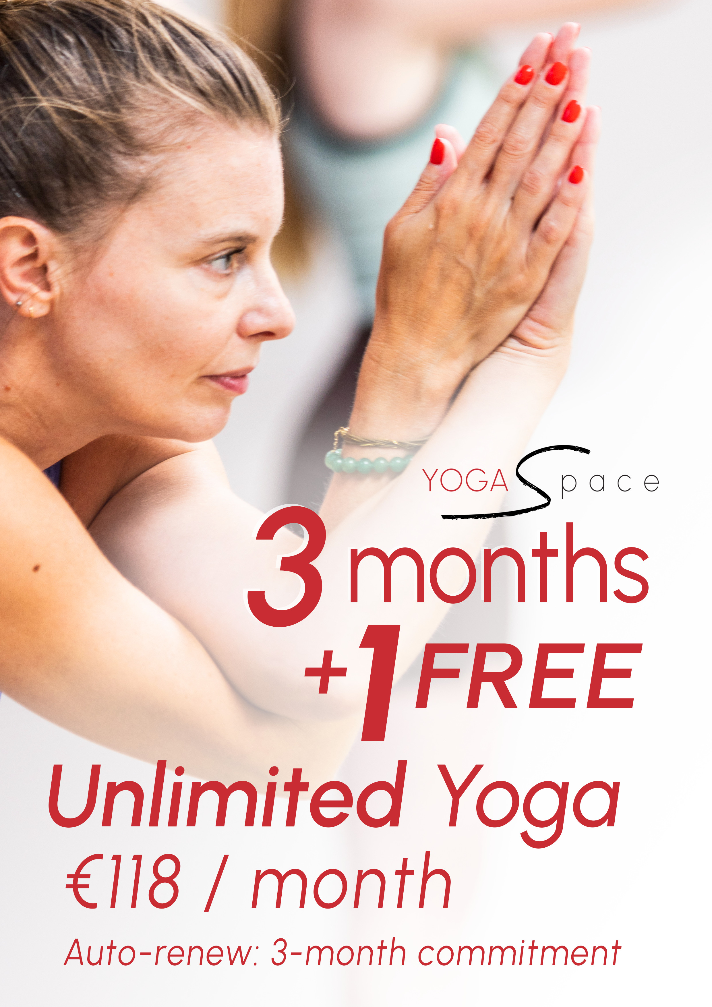
BRANDING & MARKETING AND SOCIAL POSTS